Sunnyday
certified organic coffee that’s regeneratively grown and inspired by the great outdoors

Web Design, Packaging
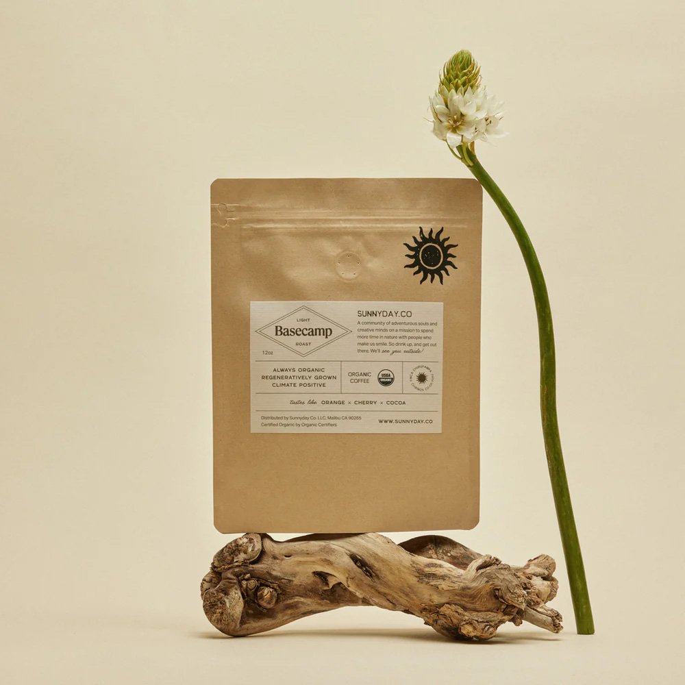
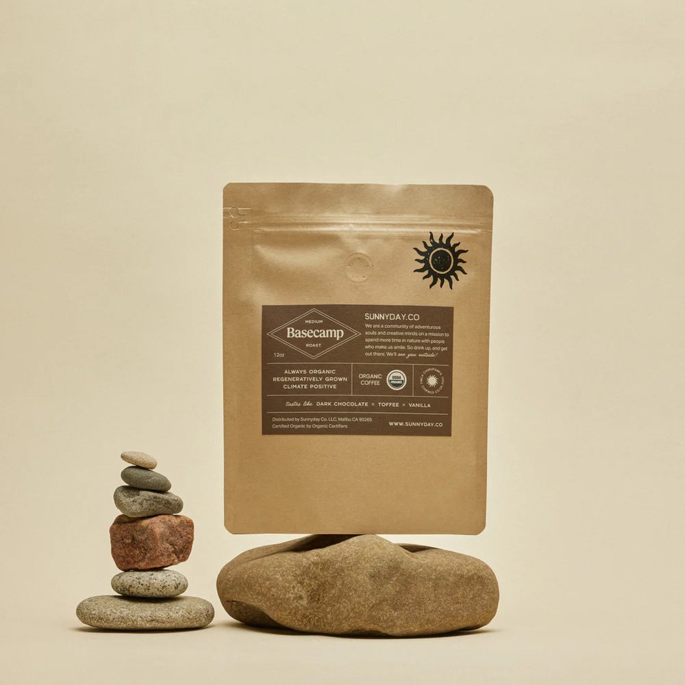
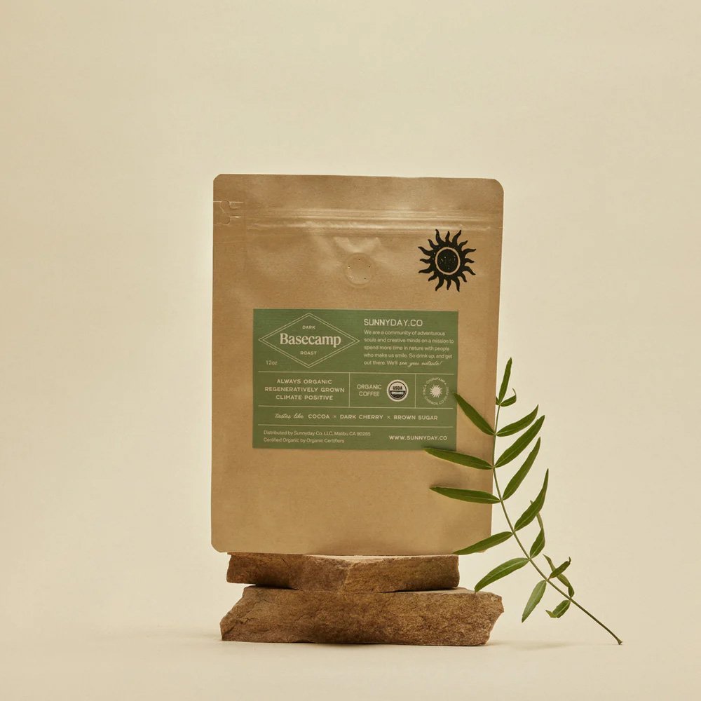
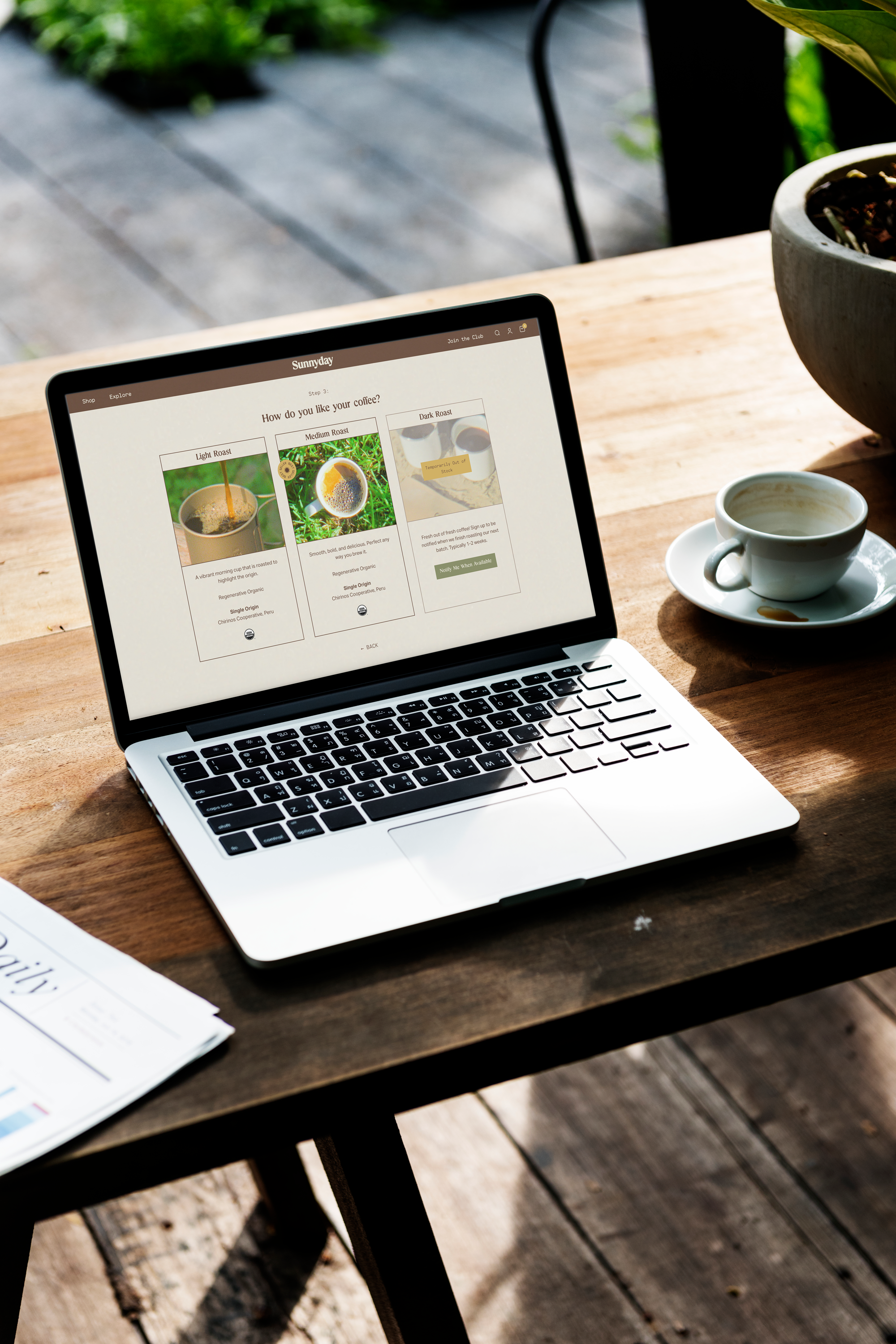
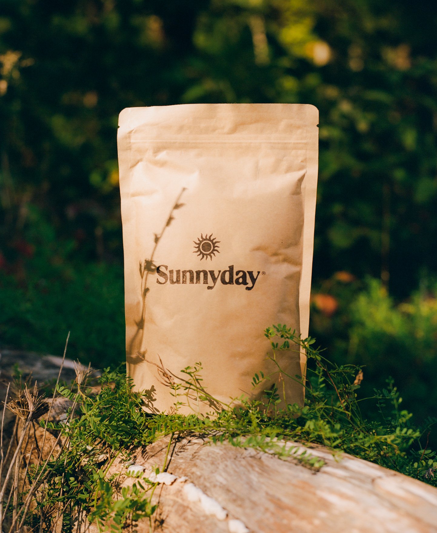
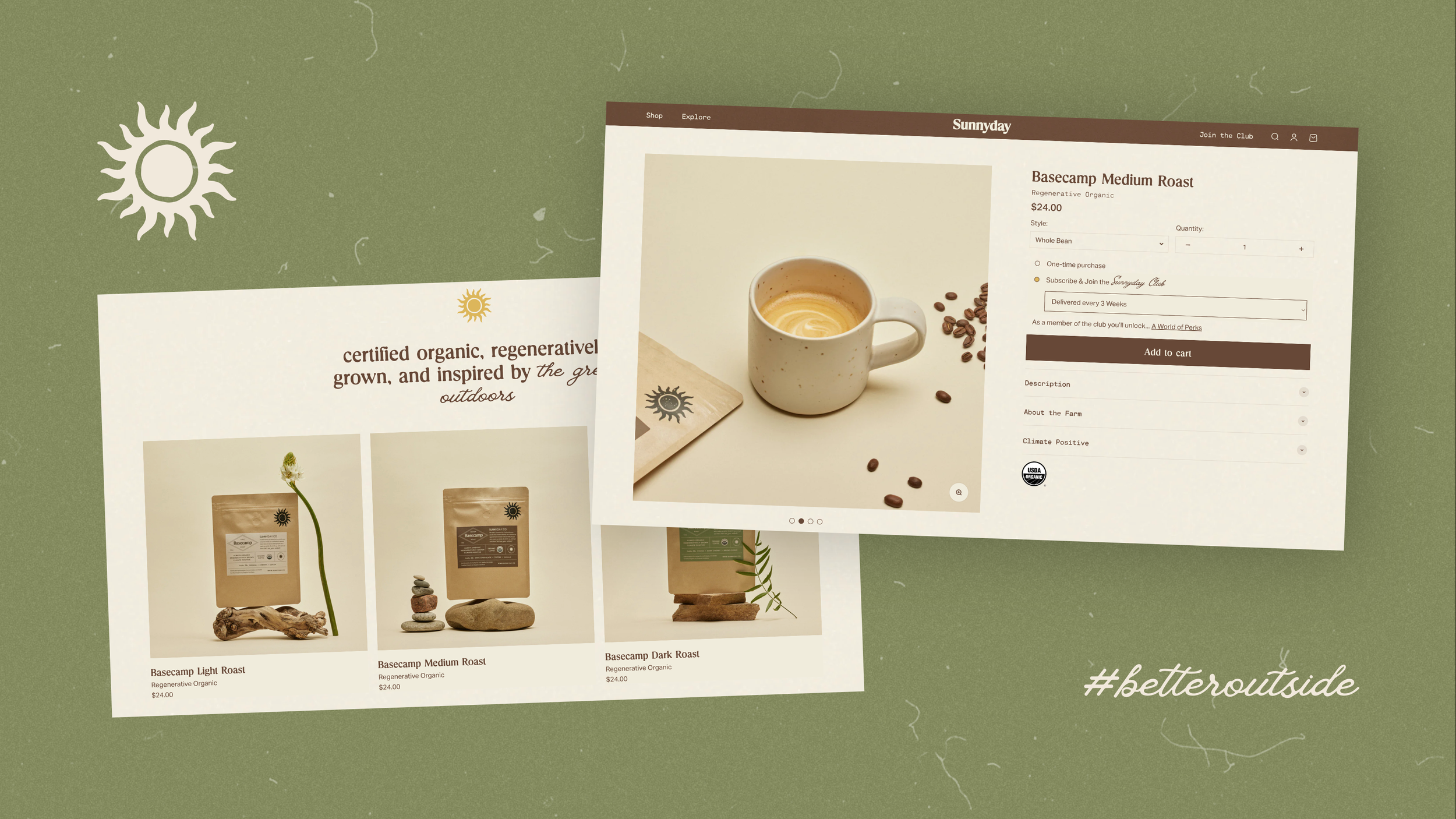
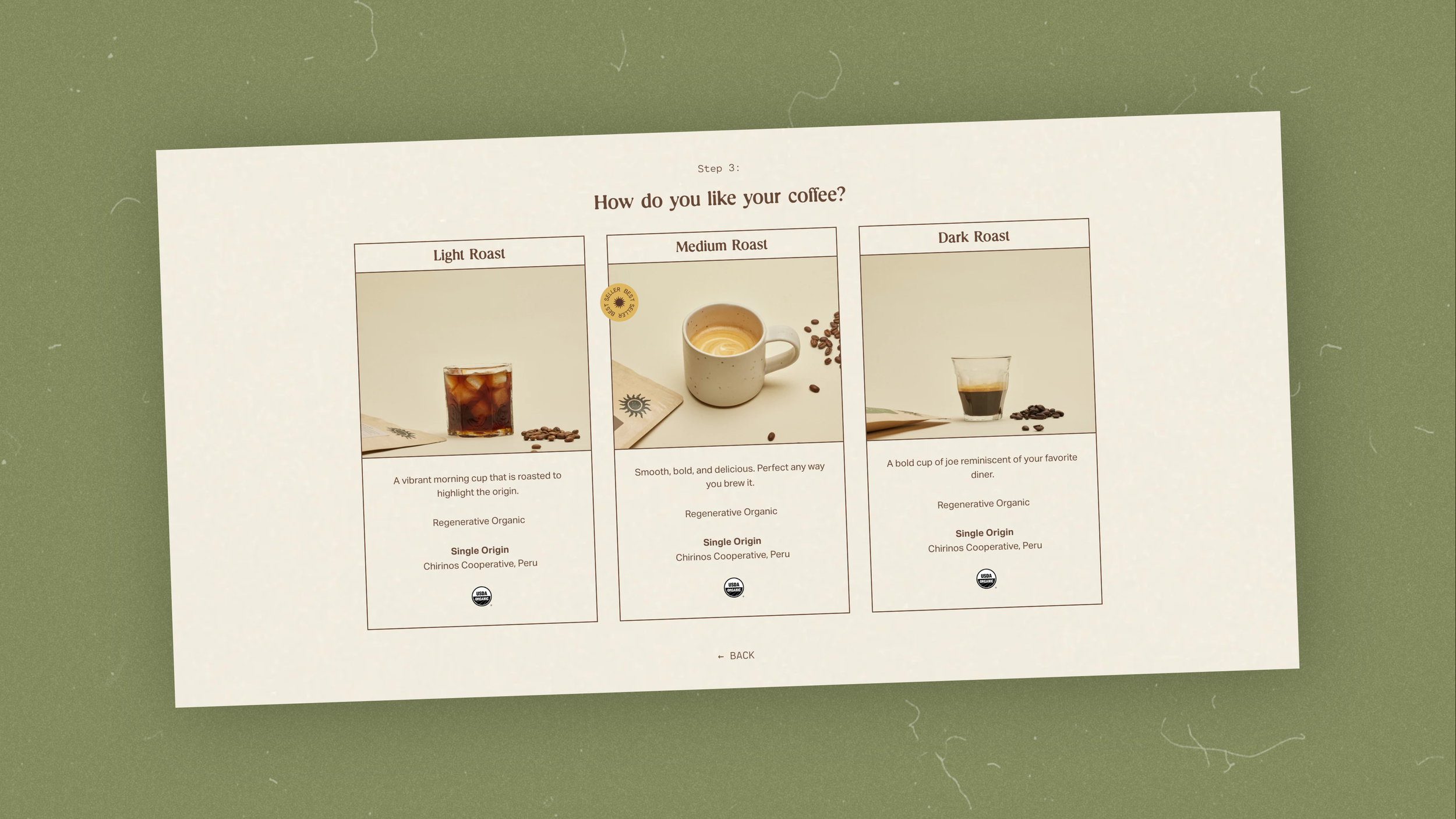
After mriskisdsgn finalized the logo, I joined the team to help design the Sunnyday consumer experience. Starting with the packaging, I worked with Bryan to recreate the brand’s original ink stamp by applying texture and rough edges to the primary logo so that it could be easily printed and reproduced. We wanted to achieve a minimal look that feels seamless with nature and adds to the aesthetic of your kitchen countertop. The label organizes the information to highlight key points related to the company’s mission. The website builds upon the branding with texture, film photography, and fonts that together hit on two predicted web trends for 2024: nostalgia and analog. The subscription questionnaire leads you step by step to the cart, making it intuitive and easy to follow. Intentionally made and designed, Sunnyday coffee is just as it’s meant to be.
Credit:
Concept/Owner: Bryan Spunt
Logo Design: mriskisdsgn
Web Development: Clawsun Design